 winpeed.
I redesigned my portfolio in one day — here's what actually changed
I was on a call with a friend and we got talking about what we were building. She looked up my name on google and boom - My website came out tops. She hailed me from quality SEO work done on my site but she laughed sheepishly at the UI. I took it in good fate.
I cloned my Portfolio site that I had not touched since 2023 and started out with a redesign in view.
The site worked. It had my name, my projects, my blog. But it didn't feel like now. The layout was the same one I'd last shipped in January 2023 on Next.js 12. JavaScript files everywhere.
A sidebar with my email and phone number taking up prime space on the home page. No dark mode. No real SEO strategy beyond whatever Next gave me for free.
I'm a frontend developer. My site is the first thing people see. That gap bothered me more than I expected.
So I gave myself one day to fix it.
What the old site looked like
If you want to see it yourself, the previous version is still live at v1.winpeed.com. I froze the January 10, 2023 commit (b7b7bcf — the last update before this redesign) and deployed it to its own subdomain. Not a mockup. The actual site as it was.
Here's how it looked like before:
The old home page was simple: profile photo on the left, intro copy on the right, contact details in a permanent sidebar. Projects and Resume buttons. It did the job when I first built it.
But a few things kept nagging me:
- The aside ate the layout. Email, phone, social links — all visible before anyone read a single word about what I do.
- Everything was JavaScript. No types, no confidence when refactoring, lots of
.jsfiles I was hesitant to touch. - It felt frozen in time. Next.js 12, older dependencies, a stack I wouldn't start with today.
- No dark mode. I work at night. My site didn't.
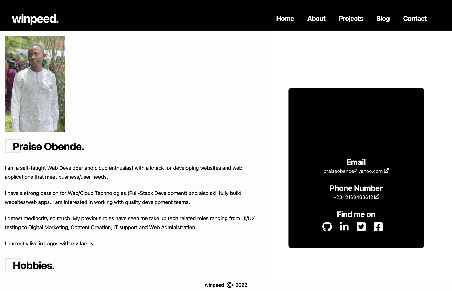
The old site: functional, but the sidebar dominated the home page.
The constraint: one day
I wasn't doing a six-week redesign project. Due to my busy work schedule, I had a day (maybe two) to ship something I could be proud about.😄
That meant ruthless scope. No new CMS. No blog migration. No fancy animation reel. Keep Contentful for posts, keep Netlify for deploy, keep the pages that already worked.
The goal was simple: make the site feel 2026, typed, and intentional.
What I changed
TypeScript, end to end
The biggest structural shift was moving the entire codebase from JavaScript to TypeScript. Components, containers, style files, API routes, config - all of it.
This wasn't about being trendy. I was tired of guessing prop shapes and breaking things silently. Typed Contentful entries, typed styled-component props, typed page props (small wins you can say)
I didn't convert everything to strict mode perfection in one pass. I typed what I touched and kept moving.
A new home page
The old layout leaned on AsideContainer — contact info as a permanent column. I removed that from the home page entirely and rebuilt around two sections:
- A hero with gradient heading, orb background, deferred profile column, and a tech marquee loaded below the fold.
- A bento grid — About, Projects, Blog, Contact as cards with clear entry points.
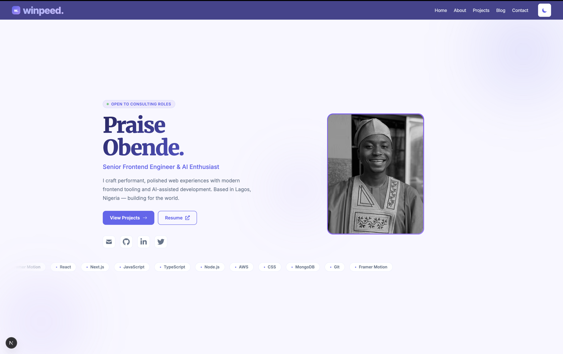
It sounds like a small change. On screen, it feels completely different. The home page is about where to go, not how to reach me. Contact details moved to inner pages via a shared PageShell component.
Dark mode
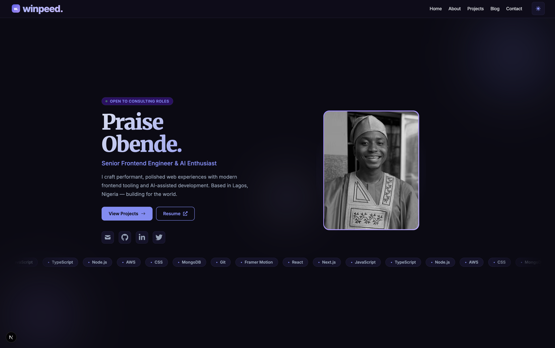
I added a ThemeProvider with localStorage persistence and prefers-color-scheme as the default. Toggle in the header. CSS variables in globals.css handle the rest.
I'd wanted this for a while. It took less time than I thought once I committed to CSS variables instead of duplicating styled-component themes everywhere.
Route skeletons
This was a quality-of-life fix I didn't know I needed until I shipped it.
On route change, instead of a blank flash, the app renders a skeleton that matches the destination — home, about, projects, blog, contact. A small useRouteSkeleton hook listens to Next.js router events and swaps in the right placeholder.
It makes the site feel faster even when it isn't. Perception is everything.
Consistent page shell
Every inner page — About, Projects, Blog, Contact — now uses the same PageShell wrapper. Title, subtitle, social strip, content. Before, each page felt like its own island.
The blog subtitle changed too: "Personal reflections, work lessons, and notes on building for the web." That matches how I actually want to write — part journal, part work and development lessons.
SEO that isn't an afterthought
I added a reusable SEO component with canonical URLs, Open Graph tags, Twitter cards, and JSON-LD structured data. Person and WebSite schema on the home page. BlogPosting schema on articles.
I also fixed sitemap generation, proper robots.txt, a web manifest, skip-to-content link, and Lighthouse CI in the pipeline.
For a portfolio, discoverability is part of the product. I treated it that way.
Stack upgrades
| Before | After |
|---|---|
| Next.js 12 | Next.js 15 |
| JavaScript | TypeScript |
| Framer Motion 6 | Framer Motion 11 |
| Contentful v9 | Contentful v11 |
| No lint hooks | ESLint + Husky pre-commit |
What I deliberately didn't do
- No backend rewrite. Contact form logic stayed minimal.
- No design system from scratch. styled-components, same as before — just cleaner.
- No new blog platform. Contentful still works. I updated my writing workflow instead.
- No pixel-perfect Figma first. I took advantage of my design system I already spent time working on in Claude design.
Knowing what to skip was as important as knowing what to ship.
The result
By the end of the day, I had a site I wanted to share.
Dark mode works. Navigation feels smooth. Pages share a visual language. The codebase is typed. SEO is intentional. The home page actually guides visitors instead of dumping contact info on them.
This was my high point in the whole process - The Old blog page vs New blog page
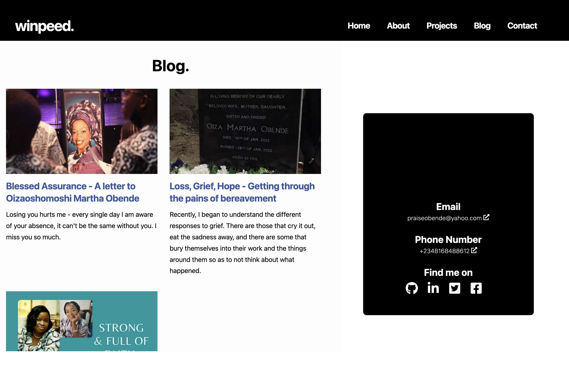
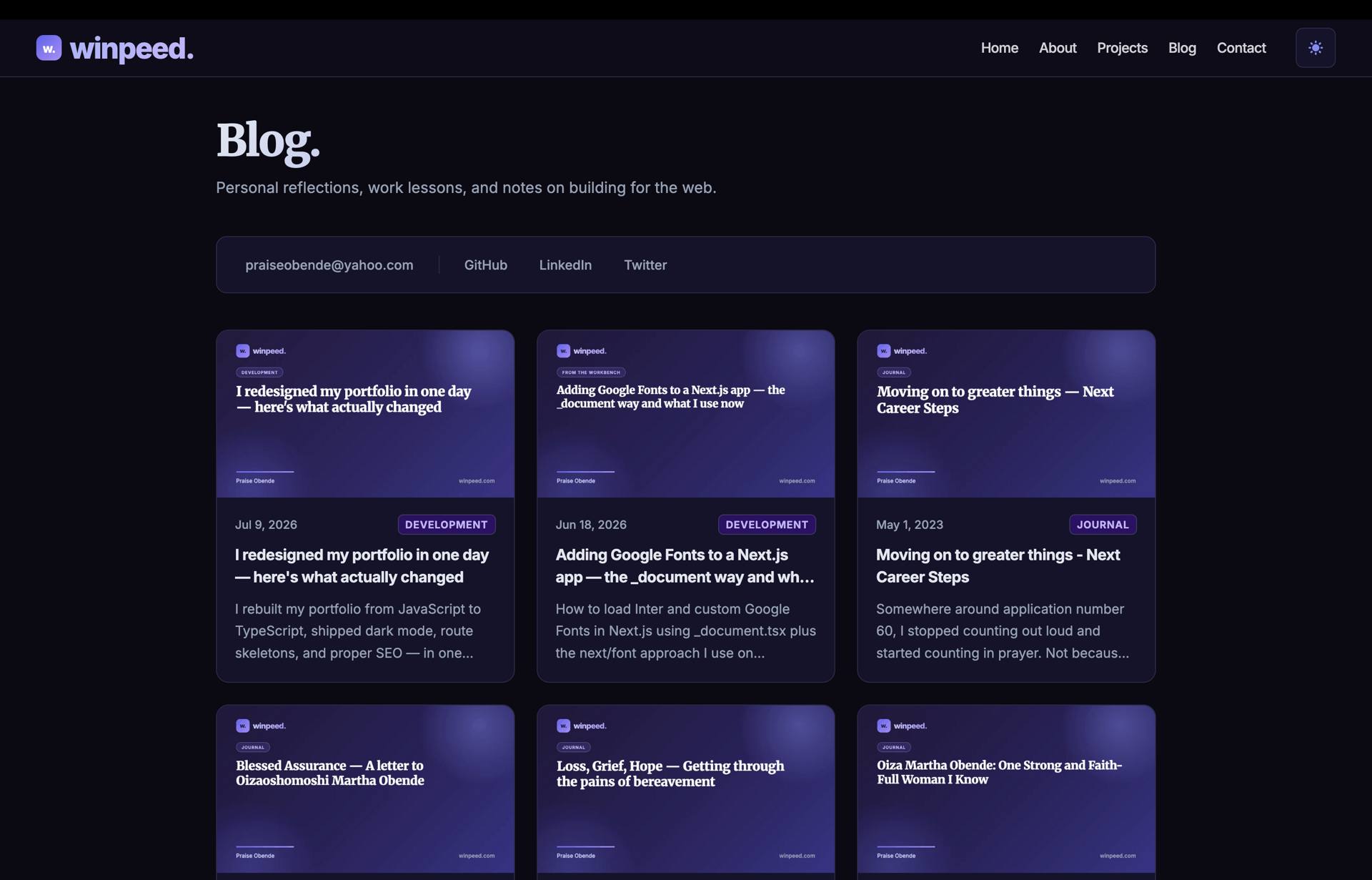
Browse the old version at v1.winpeed.com and the new one at winpeed.com. The difference is easier to feel than to describe.
Lighthouse Performance: Before vs. After
One of my primary goals during this redesign wasn't just to create a better-looking website. It was to build a faster, more accessible, and SEO-friendly experience.
To measure the impact, I ran Google Lighthouse audits before making any changes and compared them with the results after the redesign.
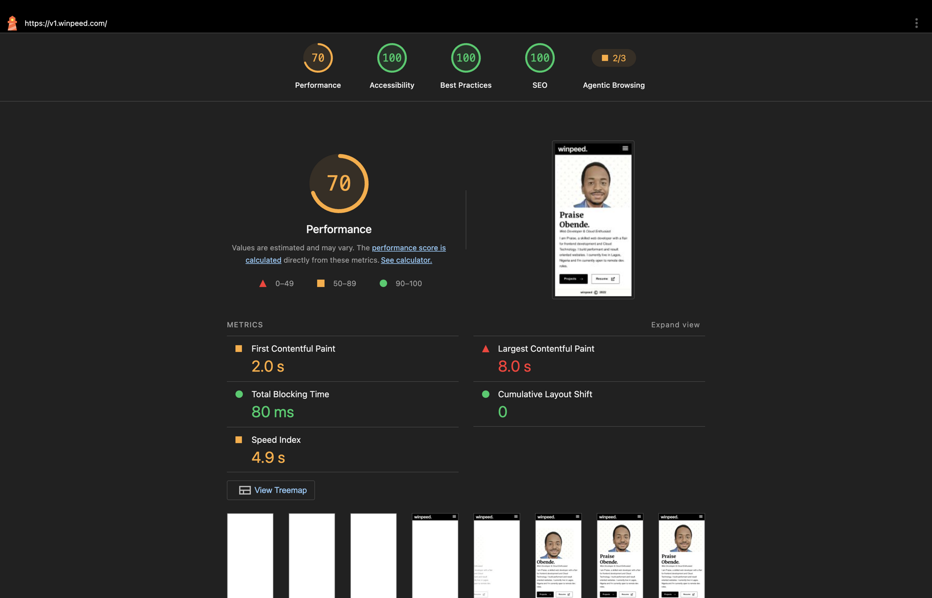
📱 Mobile — Before
The mobile audit revealed several opportunities for improvement, particularly around performance, accessibility, and render-blocking resources.
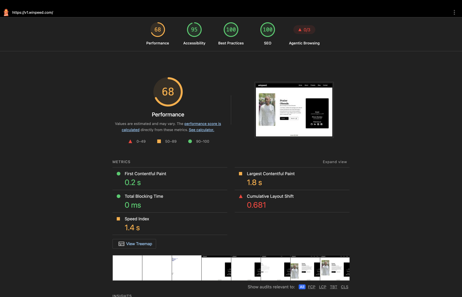
💻 Desktop — Before
Desktop performance was stronger than mobile, but there were still optimizations that could improve the overall user experience.
Key Issues Identified
Some of the most significant issues Lighthouse highlighted included:
- Large and unoptimized images
- Render-blocking CSS and JavaScript
- Unused JavaScript
- Accessibility improvements (labels, contrast, semantics)
What I Improved
During the redesign, I focused on addressing these issues by:
- Optimizing and compressing images
- Lazy loading non-critical assets
- Reducing JavaScript bundle size
- Optimizing fonts
- Eliminating unnecessary re-renders
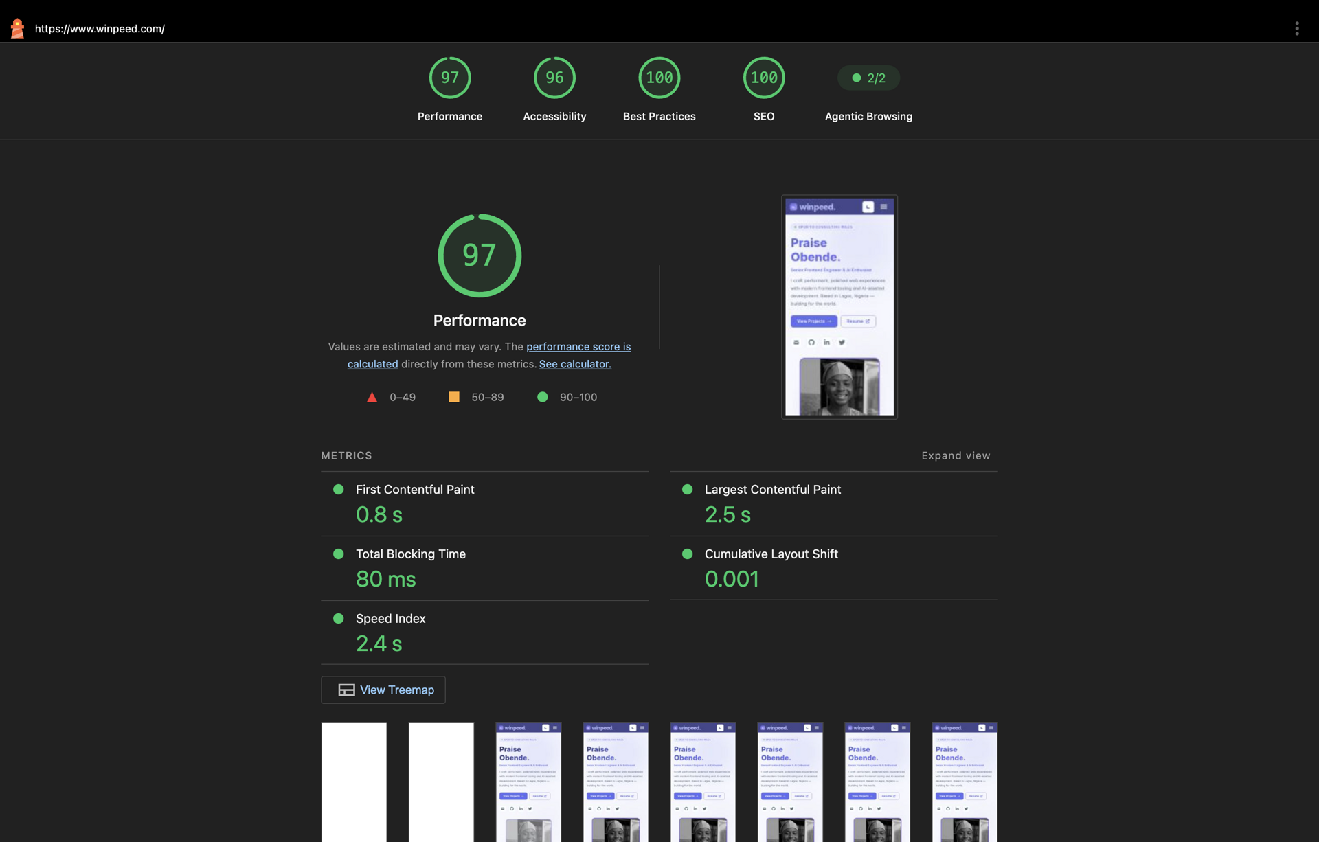
Mobile — After
The improvements resulted in significantly better Lighthouse scores and a noticeably faster experience on mobile devices.
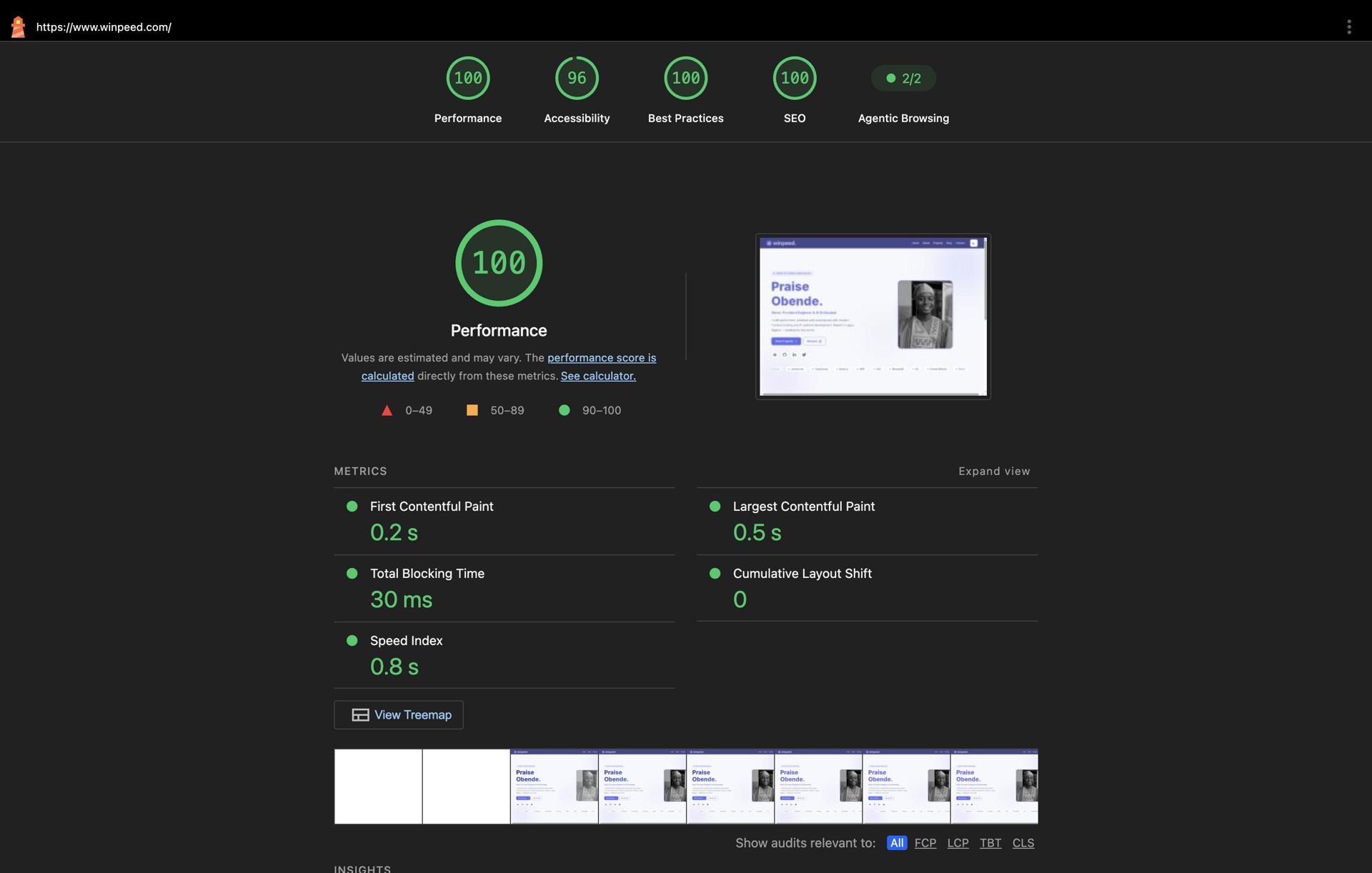
Desktop — After
Desktop performance also saw measurable improvements across all Lighthouse categories.
Results
Mobile
| Category | Before | After |
|---|---|---|
| Performance | 70 | 97 |
| Accessibility | 100 | 96 |
| Best Practices | 100 | 100 |
| SEO | 100 | 100 |
Desktop
| Category | Before | After |
|---|---|---|
| Performance | 68 | 100 |
| Accessibility | 95 | 96 |
| Best Practices | 100 | 100 |
| SEO | 100 | 100 |
Note
Lighthouse scores are just one measure of quality. However beyod that, they provide a useful benchmark for tracking improvements.
More importantly, these optimizations translated into a faster, smoother, and more accessible experience for real users.
What I'd do differently if I were to do this again.
Screenshot before you deploy. I almost shipped without capturing the old site properly. If you're writing a rebuild post, freeze the exact commit you mean (not just "an old deploy"), tag it, deploy it to a subdomain, and screenshot it. After this, ensure you verify the live archive matches that commit before you publish.
Migrate in layers. I tried to do too much at once early in the day. Typing one route at a time would've been calmer. However, big shout to cursor AI. It did most of the heavy lifting for me and bailed me out when I ran into major issues.
If you're thinking about your own rebuild
You don't need a week off. You need a clear scope and a version of the site you're willing to archive.
Tag your last commit. Deploy it to a subdomain. Screenshot everything. Make use of AI tools such as Cursor AI, OpenAI, or Claude AI to speed up your development workflow.
Ship the new thing and keep it fresh.
Your portfolio is a living project. Mine was overdue for a day of honest work.
Old site: v1.winpeed.com New site: winpeed.com
Share this post